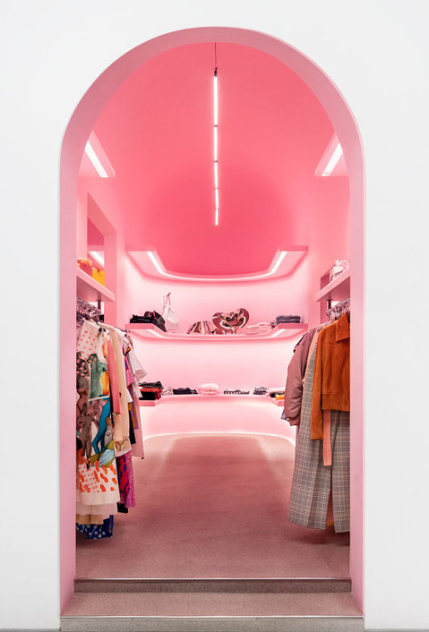
At Luminii, we believe that lighting matters. Those are powerful words and can be interpreted in many ways. It isn’t just the application of the lighting that matters, but the LIGHT itself matters. Without light there is no life. Without light, there is no design, no shape, and no dimension. No matter how wonderful an interior design is, if it is not illuminated, it just isn’t visually there. If it is not illuminated properly, it can fall flat. A beautiful landscape is just a dark expanse without light, just as an amazing work of art may as well live in a storage unit without carefully considering the light it’s bathed in.
Now, let’s take that philosophy a step further and talk about the quality of light. The quality of the light is instrumental in bringing spaces to life in either a good way or bad way. Good quality light can evoke emotion, create moods, and even support healthier living spaces. On the other hand, if the light is of poor quality, it can muddy a beautiful view, misrepresent special details in carefully selected finishes, or even make a person’s skin tones appear off or muted.
Good lighting
Bad lighting
For this discussion, we first need to talk about the COLOR OF THE LIGHT SOURCE, the quality of that color, and its importance in accurately rendering objects, spaces, and people within them. There are two main measurements that are important to know about if you want to create quality lighting results:
-Color Temperature (CCT)
-Color Rendering (CRI and TM30)
We all have a very intimate relationship with light based on age, experience, and geography. Color temperature is the single most important thing to determine first when choosing light sources, and is probably the most subjective.
The definition of Color Temperature from Oxford Languages:
‘The temperature at which a black body would emit radiation of the same color as a given object.’ When a metal is heated the color emitted to the visible eye changes as the temperature increases from a warm reddish glow to white and then to blues and dark violets. Measured in Degrees Kelvin.
In simpler terms, Correlated Color Temperature (or CCT) is the metric we use to measure the coolness or warmth of a light source. Responsible manufacturers will include the CCT details by listing them somewhere on a product specification sheet, on the fixture itself, or on the packaging.
Solid state lighting has changed the game and changed the lighting industry forever. It has brought lighting deep into our digital world and gives us the opportunity to pick and choose the color of the light. We can digitally control color temperatures to simulate daylight or to dim like incandescent.
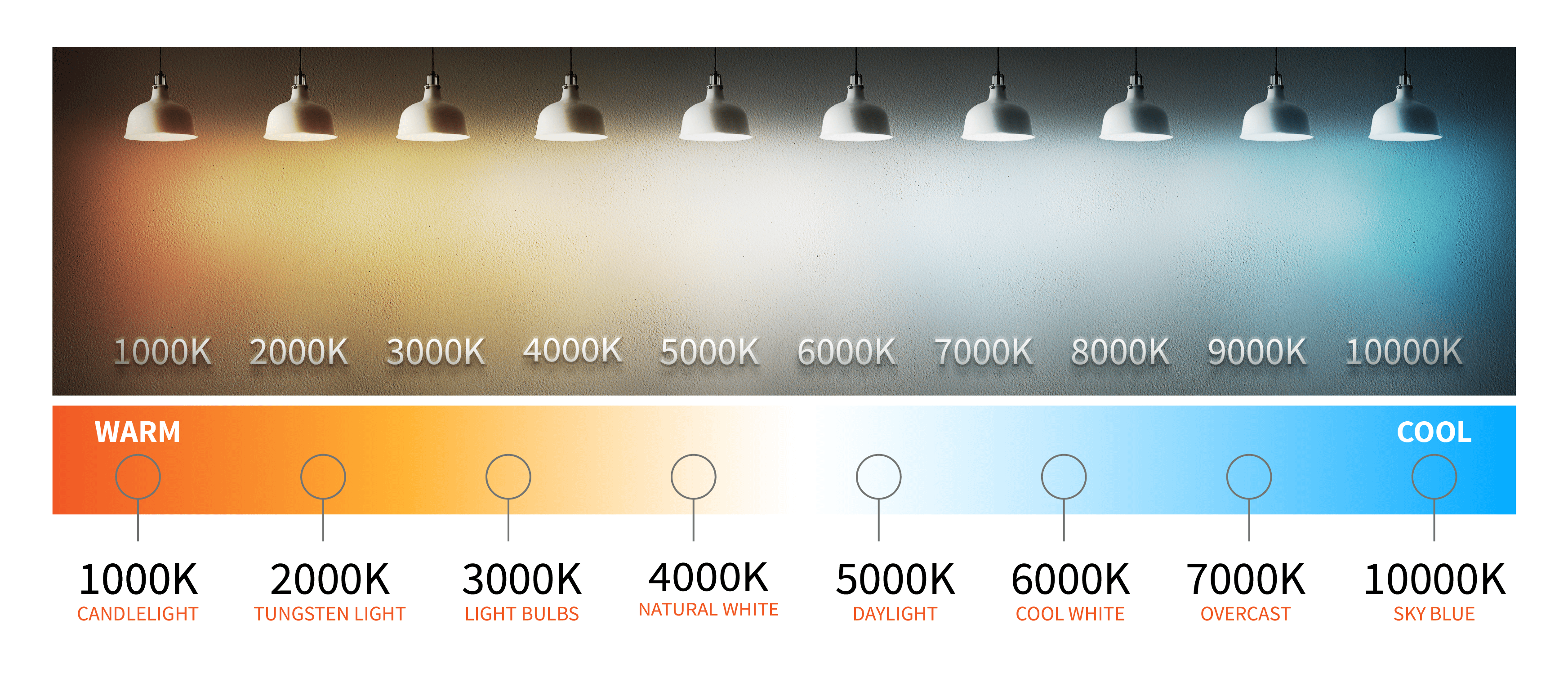
Choosing a CCT establishes the overall look and mood of the space, setting the scene. CCT can also change the perception of brightness in a space and even the size of the space. For example, illuminating with warm color temperatures (1800K-2900K) can make a space appear cozier and produce a feeling of calm. It may also appear to be less illuminated than spaces illuminated with the same lumens but in a higher CCT. On the other hand, illuminating the same space with cooler color temperatures (3000-5000K) can create a perception that a space is larger, energetic and supports productivity, but it could also feel less personal.
It’s also crucial to know the color palette of the surfaces you are lighting, including the estimated reflectance values (Light to Dark) of walls, ceilings and floors. As an example, surfaces which are dark in value like walnut or deep paint hues may require higher intensities of light, if surfaces are lighter in value, then dimmers might be an option to explore. Either way, you want to make sure you integrate sources that dim down to 1% or lower.
Once you know colors and values, the next thing to determine is how the color of light source will render those surfaces. Warm, earthy tones will be enhanced when illuminated with warm CCT’s and conversely greens, blues, and cool grays will pop when illuminated with higher, cooler CCT’s.
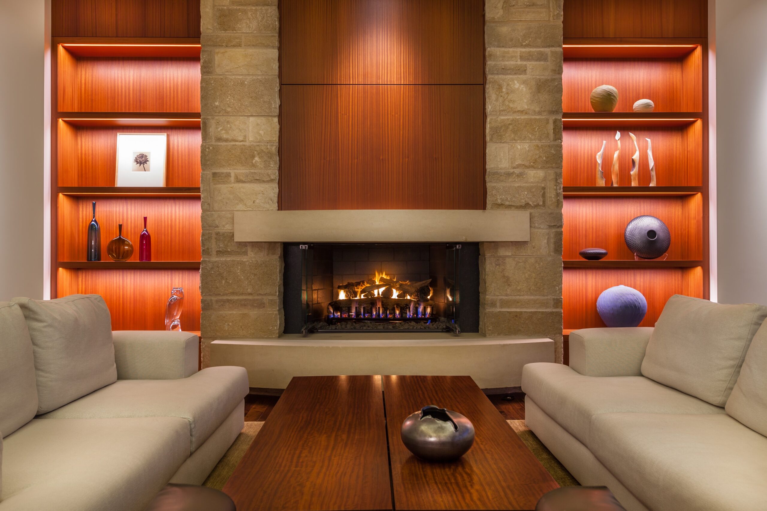
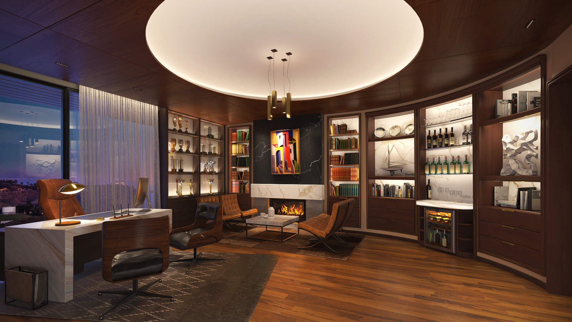
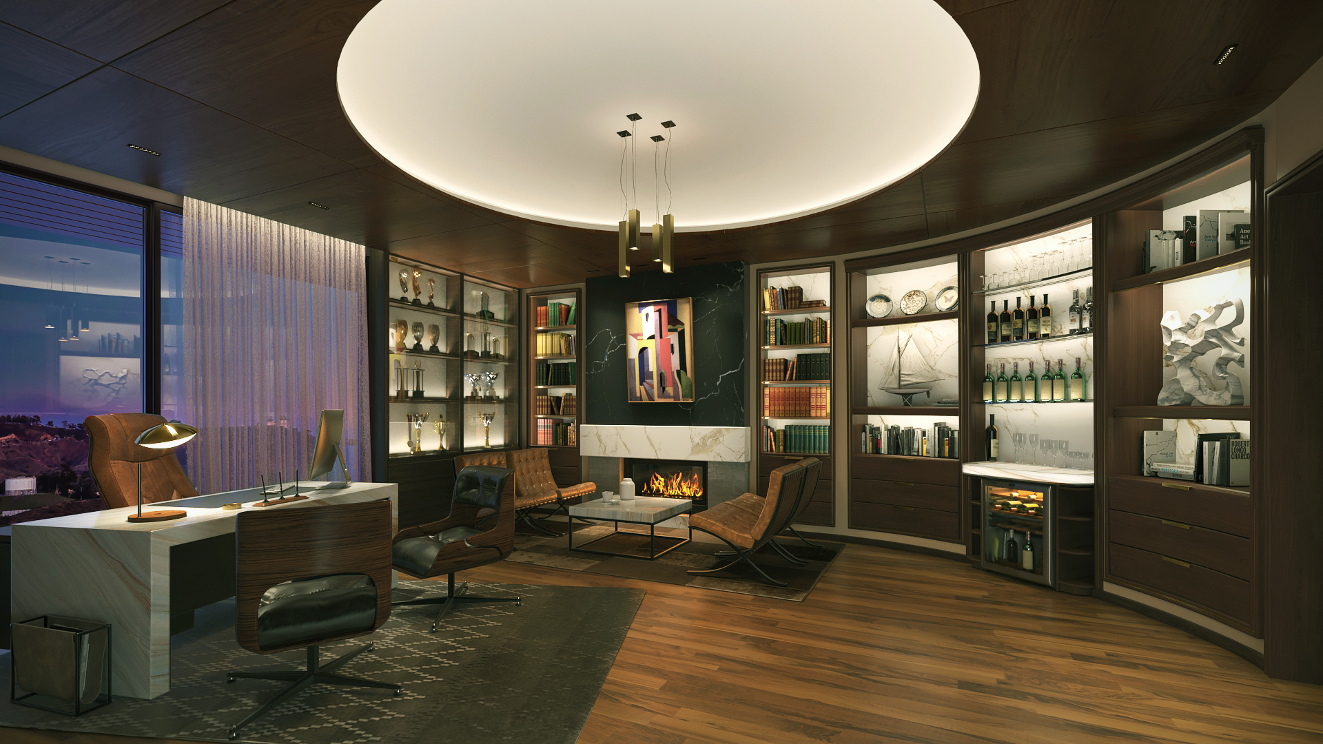
This example shows a successful use of 2700K. If the designers had chosen a cooler color temperature when lighting the fireplace surround, they would have lost the richness of the stone, and the brilliant orange behind the artwork would have been ‘muddied’. We recommend asking to see samples with different CCT’s if you are not sure what effect you want.
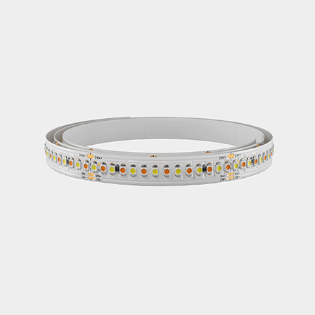
Did you know that when you dim LED that it typically stays the same color temperature? On the other hand, when you dim incandescent, it warms as it dims? Luminii Warm Dim LED Strip Light provides you with the same effect as dimming incandescent. As the color dims and warms, the color quality is maintained (CRI’s above 95)
Daylight (5500K-6500K) is a very cool color temperature. It creates drama in lighting design, making whites show true and giving an overall energetic vibe. As you think through your fixture placement, remember that natural daylight will render your finishes differently when compared to artificial light options, so it’s important to understand how the natural light cycle will affect the space before determining the final placement of fixtures within a space.
To understand how one light source is vastly different from another in light quality, it is useful to see a visual representation of the different wavelengths that objects are receiving from each source. We do this with a Spectral Distribution graph which shows the relative intensities of each wavelength.
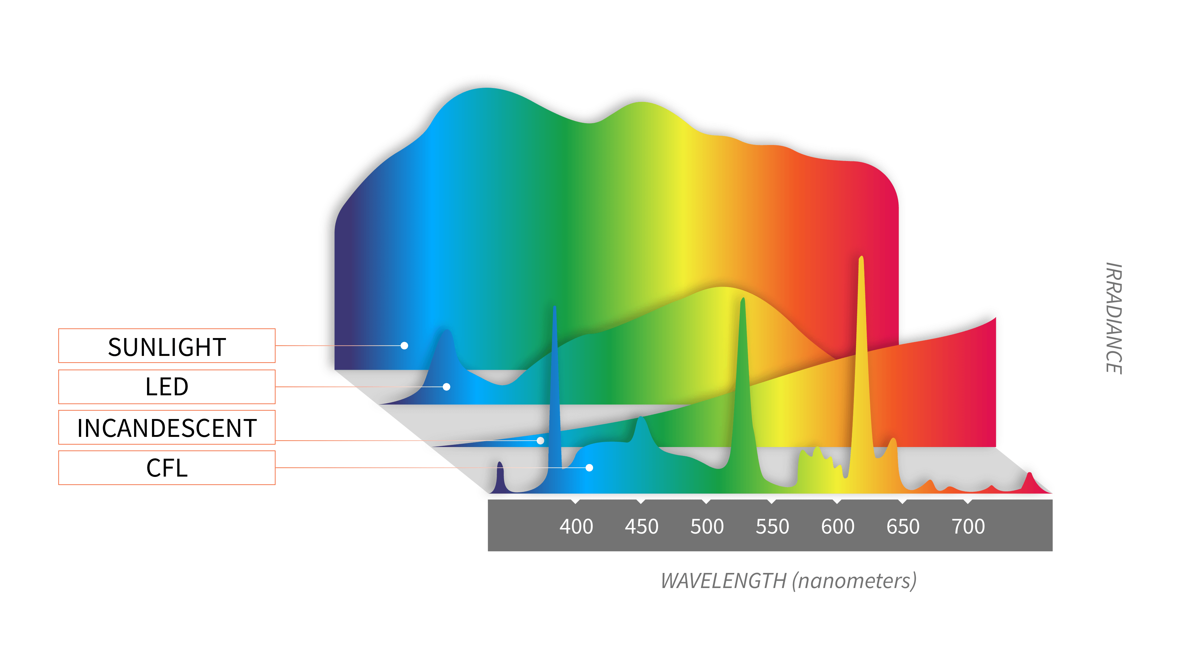
Popular Mechanics: “ultimate Light Bulb Test: Incandescent vs Compact Fluorescent vs LED by John Herman, Sep 20, 2011
Sunlight has every color in the visual spectrum represented: thus, it is considered to have perfect color rendering. You can see that incandescent is strong in the reds and does a great job of rendering warm tones. Conversely, fluorescent is missing many of the wavelengths.
Seeing is truly believing. LED may not have the intensity and full spectrum of sunlight, but it’s a close second, producing wavelengths in each color group, more than all other light sources. With a full spectrum represented, you can see all colors true with near perfect accuracy.
Although you would assume that the established CCT metrics are absolute, not all LEDs are created equal. CCT’s can vary up to 300 degrees Kelvin from one manufacturer to another. The color variations may be quite noticeable if you do not take care to pick fixtures that are from a known manufacturer and source.
Yes, this brings us to the next element to determining light quality.
The Well Building Institute defines Color quality as:
Color quality is a function of the spectral output of a light source, the spectral absorbance/reflectance of an object, and the sensitivity of the eye’s cone photoreceptors to different wavelengths of light, which we perceive as color. Color quality impacts visual appeal and can either contribute to or detract from occupant comfort. Poor color quality can reduce visual acuity and the accurate rendering of illuminated objects. For instance, foods, human skin tones and plants may appear dull or unsaturated under lights that have low color quality metrics
Since 1974, the lighting industry has been using CRI to measure the quality of light sources. CRI provides a way to measure the impact of different light sources on the perceived color of objects. First, the CCT of the light source being rated is determined. Then, eight standard pastel color samples are illuminated – first by the light source and then by a light from a reference source matched to the same CCT. If none of the samples change in color appearance, the light source is given a CRI rating of 100. The CRI scale is 1-100.
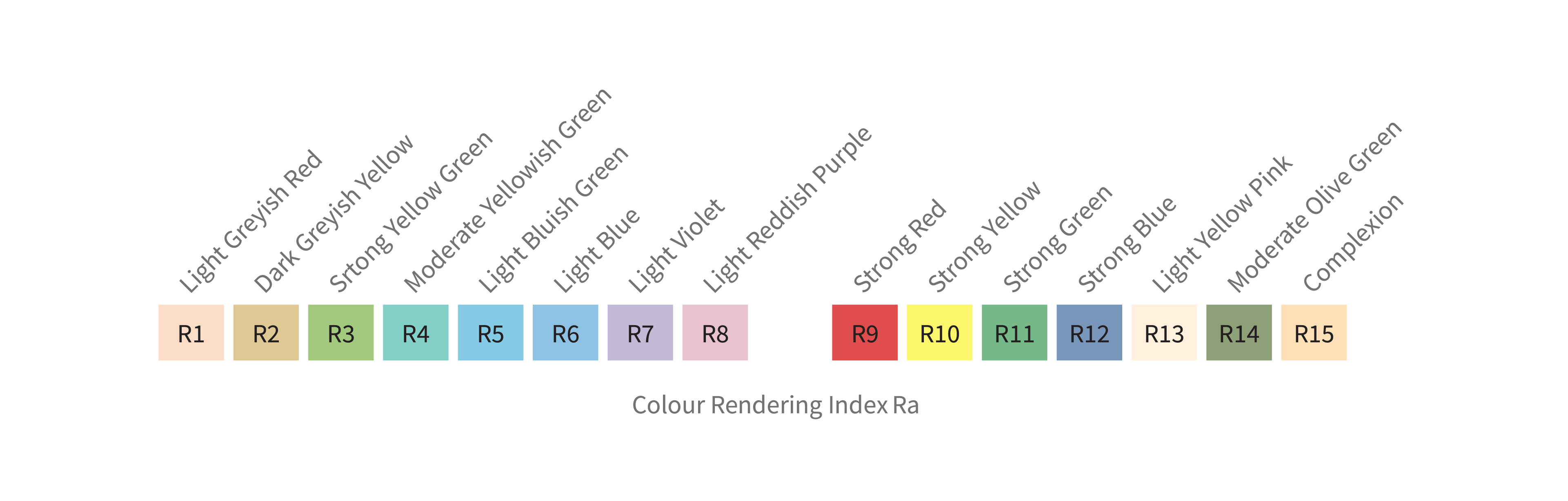
Many years later, an additional set of 7 colors was added to represent saturated colors like red…R9, also a few to represent skin tones and foliage.
The higher the CRI value, the better the light’s ability to render individual colors true.
Without a high R9 value, skin tones and natural finishes, such as wood, look lifeless. Why have a beautiful new chef’s kitchen and dining room if the food you are preparing looks grey and desaturated?

The technologies and lighting platforms have changed dramatically since CRI was developed over 50 years ago. CRI was criticized over the years for not representing the real-life subtleties of color as we experience it in real life. The reference colors did not include colors found in nature and the nuances of human skin tones. CRI also only measures color fidelity. Enter TM-30-15, which was developed in 2015 by the Illumination Engineering Society (IES).
TM-30 is a much more complete representation of the quality of color a source will produce and render an object. Using this newer color methodology could help you make more informed choices as you build out your lighting design.
Color Fidelity
Color fidelity is the accurate rendition of colors so that they appear as they would under familiar (reference) illuminants.
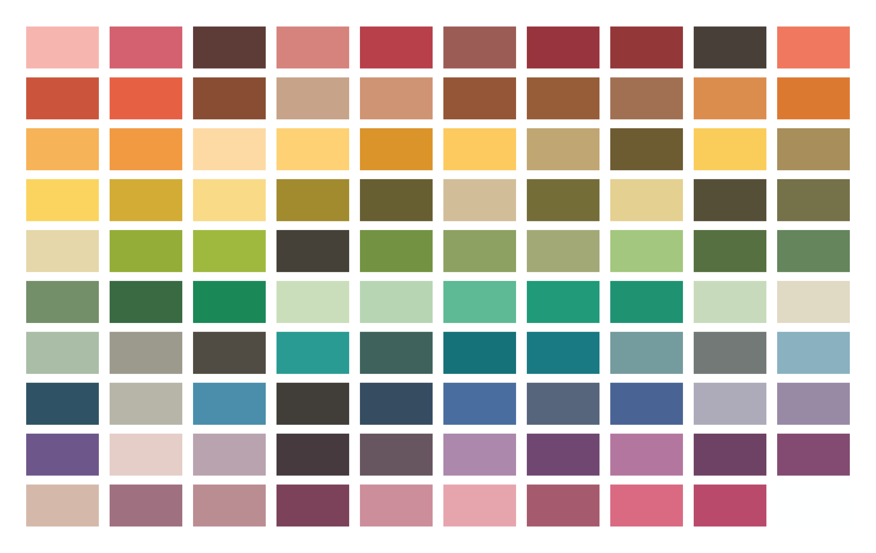
Ninety-nine samples represent a wide variety of objects, including paints, textiles, inks, skin tones, natural objects (e.g., food, flowers, foliage), and plastics. They cover a wide range of hue, chroma, and lightness (Rf: Scale from 0-100).

Ninety-nine samples represent a wide variety of objects, including paints, textiles, inks, skin tones, natural objects (e.g., food, flowers, foliage), and plastics. They cover a wide range of hue, chroma, and lightness (Rf: Scale from 0-100).
Color Gamut
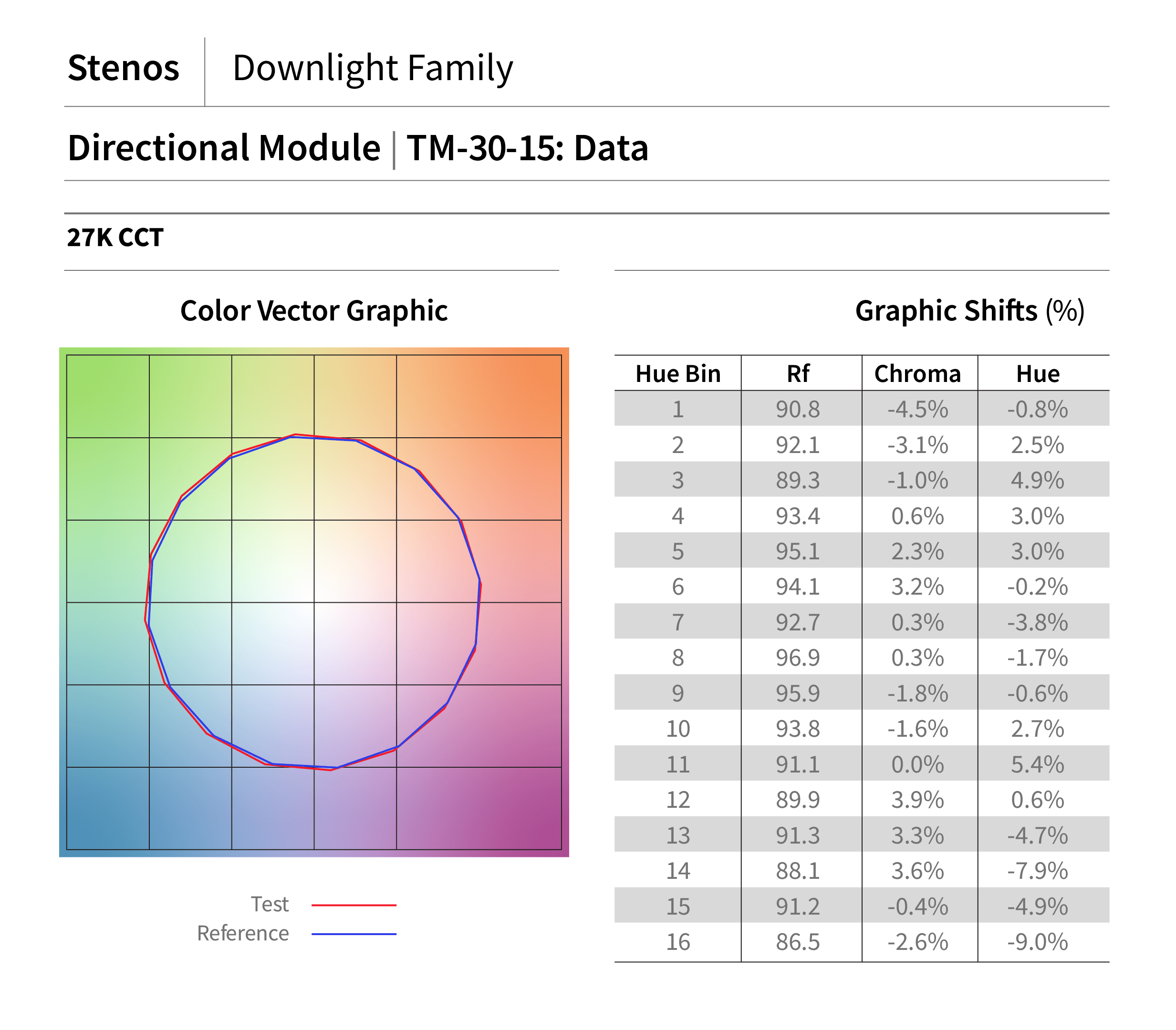
The neutral score is 100 with typical scores ranging between 60-140. The most desirable scores would be greater than 100 and undesirable scores would be less than 100.
Color Vector
Visual description of hue and saturation changes. This graph will quickly show you if the test source has veered off course from the reference.
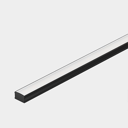
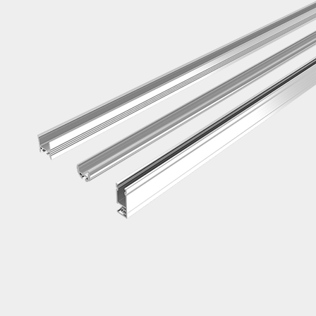
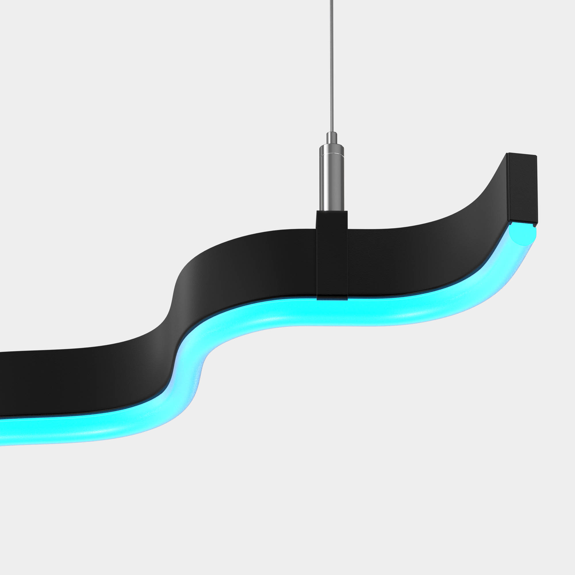
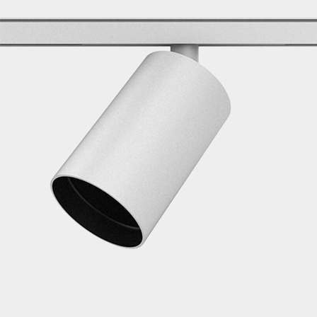
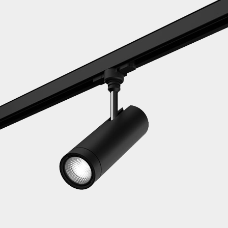
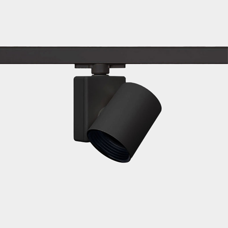
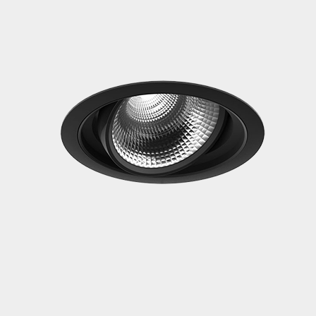
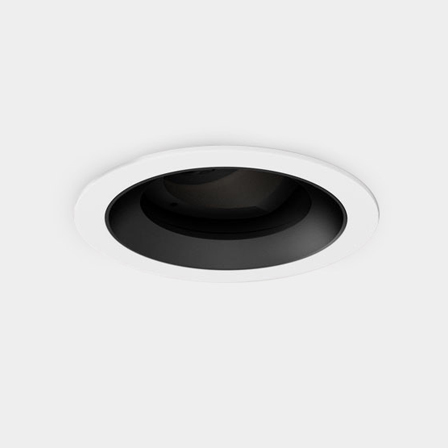
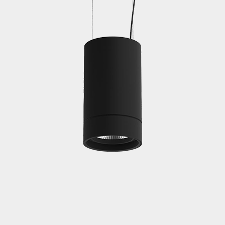
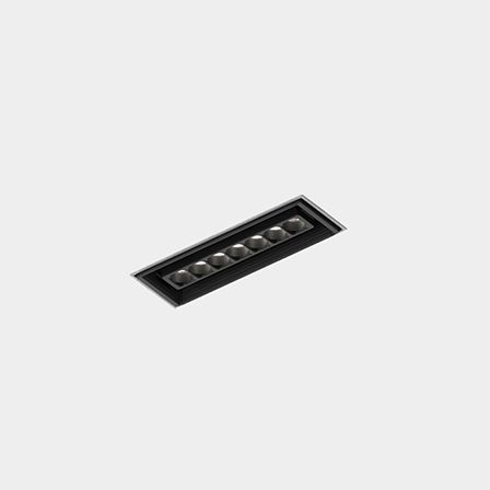
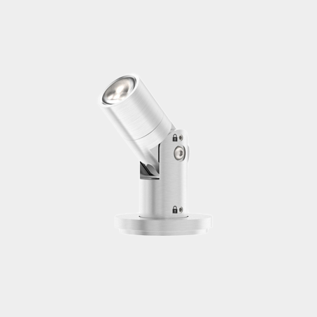
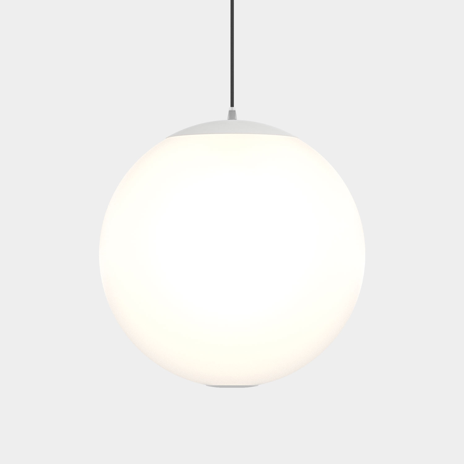
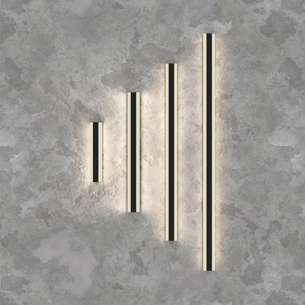
Luminii sources are always above 90 CRI, with most as high as 98 CRI with Rf values above 90. Discover some of our most trusted and popular products to illuminate your most coveted spaces.
So, the next time you are mapping out that HGTV-inspired kitchen design, finding the perfect location for that valuable piece of art or how to best show off your travertine floors, don’t forget the light.