Please complete the form below to generate plaque order details for your sconce: 
Next Steps:

  1. Complete the form: A copy of your responses will be emailed to you.
  2. Attach to your Quote Request: Include these responses as an attachment or paste them directly into your Quote Request and send to our Inside Sales team at sales@luminii.com for further assistance.
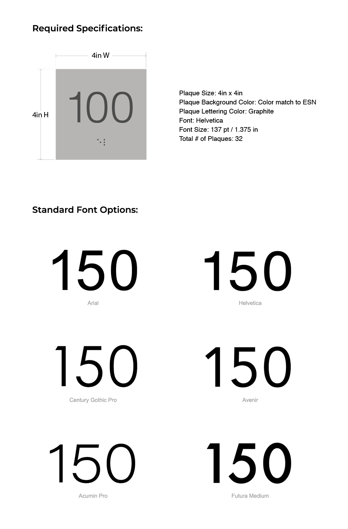
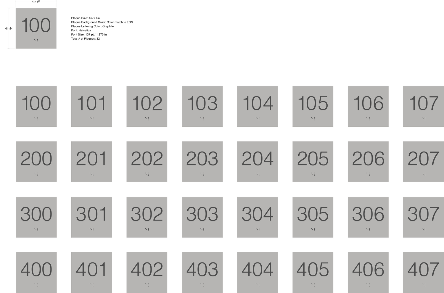
  3. Approve your design: Our team will create a vector mock-up of your plaque design (.eps, .svg, .pdf, or .ai) and email you a PDF (example, right) for final approval before production begins.

Plaque Specifications:

Plaque Size

  • Any size up to 25 square inches. For door plaques larger than 25 square inches, plaques will be priced per square inch.
  • Plaques come at a standard thickness of 1/16” thick.

Plaque Background Color and Plaque Lettering

  • Color match door panel finish, or select from Custom Ral (Premium)
  • Characters and symbols must contrast with background. Light characters/symbols on dark background or vice versa.
  • Braille is printed clear unless requested otherwise.

Font

  • Select from standard fonts include Arial, Helvetica, Century Gothic Pro, Avenir and Futura. Apple fonts or Adobe Typekit fonts can be accommodated.
  • For any unsupported/paid fonts, customer must supply .otf or .ttf font files to Luminii.
  • ADA requirements specify a size range for text height of 5/8 – 2 inches. Braille should have a minimum of 3/8 inch clearance on all sides.
  • Use simple, sans serif fonts, in medium or bold weight. Do not use italics, scripts, or other hard-to-read styles.

Font Size

  • Select a size that allows for space on all 4 sides of lettering (min. 3/8in), and enough space to be ADA compliant with braille. For ADA compliance see local ADA regulations.

Luminii is not responsible for compliance with ADA regulations.

This page contains recommended best practices. To ensure compliance with all ADA requirements, we refer you to local ADA regulations.

The American Disabilities Act (ADA) has several requirements for signage, including:

  • Character height: The height of characters on an ADA sign should be between 5/8 in and 2 in. The height is measured from the baseline of the lowest tactile character.
  • Character spacing: The space between characters should be at least 1/8 in, but no more than four times the character stroke.
  • Character style: Characters should be in a sans serif font, and not in italics or condensed.
  • Character case: Characters should be in uppercase.
  • Character depth: Raised characters should be at least 1/32 in above the sign’s base.
  • Character proportions: The width of the uppercase letter “O” should be at least 55% and no more than 110% of the height of the uppercase “I”.
  • Braille: Signs that identify a public space should be in Grade 2 Braille.
  • Contrast ratio: Signs should have a high contrast ratio between the background and the content.
  • Finish: Signs should have a non-glare finish.
  • Pictograms: Signs should include the appropriate pictograms, such as a symbol for stairs or restroom.
  • Tactile characters: Tactile characters should be located 48 in to 60 in above the ground.
  • Clear floor space: There should be a clear floor space of at least 18 in by 18 in centered on the tactile characters.

Some states and municipalities have additional signage requirements that go beyond the federal ADA regulations.

Plaque production is 6 weeks after submission of design. Plaque lead time cannot be expedited.
Completed door number plaques are sent by mail directly to customer to be attached to the sconce
panel on site once sconces have been installed.

For assistance contact sales@luminii.com

Back to top